Designing Scalable Design Systems in the Age of AI
How token-based design systems and AI-assisted workflows help teams ship consistent products at scale.
As digital products grow, so does their complexity. Features expand, teams scale, and maintaining consistency across platforms becomes increasingly difficult. This is where design systems become essential not just as UI libraries, but as operational frameworks that help teams design, build, and scale products more efficiently.
A strong design system creates shared rules, reusable components, and a consistent visual language that connects design, development, and product strategy. When implemented correctly, it reduces duplication, speeds up delivery, and improves the overall user experience.
What Makes a Design System “Scalable”?
A scalable design system is not simply a collection of components. It is a structured system that can evolve alongside a product without becoming inconsistent or difficult to maintain.
Scalable systems typically include:
- Design tokens for colors, spacing, typography, and elevation
- Reusable UI components
- Clear naming conventions
- Documentation and usage guidelines
- Accessibility standards
- Shared patterns between design and development
The goal is not only visual consistency, but also operational clarity. Teams should be able to make decisions faster because the system already defines many of the rules.
A Token-Based Foundation
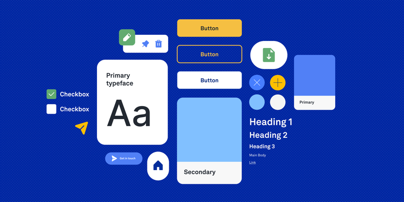
For Nabogo and similar product work, I structured the design system around design tokens which are named values for color, type, spacing, and interaction that stay consistent in Figma and in code. Tokens are the foundation while components and screens are built from them, not the other way around.
A token-based system typically layers like this:
Primitive tokens
Raw values the brand owns:
- color ramps (brand greens, neutrals, semantic reds and ambers)
- font families and base sizes
- spacing scale and corner radii
- elevation and border weights
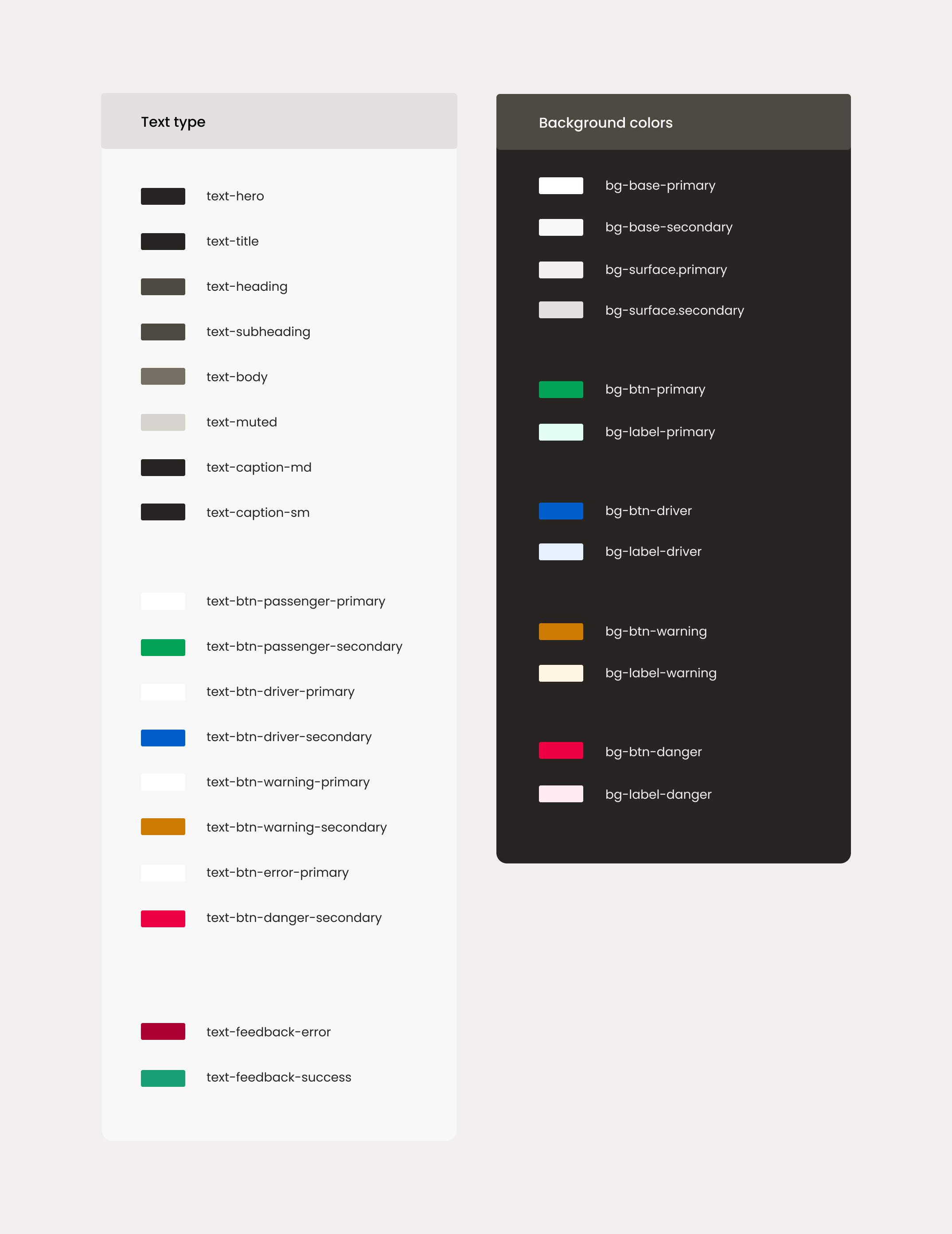
Semantic tokens
Names that describe purpose, not appearance:
text-primary,text-secondary,text-disabledsurface-default,surface-elevated,surface-successborder-subtle,border-focusaction-primary,action-destructive
Semantic tokens make theme changes and accessibility fixes easier. If you update the mapping once, and buttons, inputs, and cards stay aligned.
Component tokens
Component-level decisions that reference semantics:
- button padding, label styles, and icon sizes
- input heights, focus rings, and error states
- card backgrounds, chip styles, and bottom navigation
- ride cards, headers, and profile sections for the mobility product
Documentation & handoff
Tokens are documented in Figma variables, Storybook, and code so designers and developers
share one vocabulary. Instead of debating hex codes per screen, teams reference
surface-success or spacing-md making products easier to scale
and maintain over time.
Why Design Systems Matter More Than Ever
Modern digital products move fast. Teams ship features continuously, support multiple platforms, and collaborate across disciplines. Without a design system, inconsistency grows quickly:
- duplicate components
- mismatched UI patterns
- accessibility issues
- slower development
- fragmented user experiences
All of these were problems at Nabogo ApS due to lack of a design system and product design direction. A design system creates alignment between designers, developers, product managers, and stakeholders and it becomes a shared language for building products.
How AI Is Changing Design System Workflows
AI is rapidly transforming how design systems are created, maintained, and documented. Instead of replacing designers, AI acts as a collaborator that accelerates repetitive and operational tasks. The shift is not only what we document, but who we document it for. For example, increasingly, for AI agents as much as for human teammates.
The biggest advantage is speed combined with consistency, as long as the system’s rules are explicit.
Writing docs for AI
Instead of writing complex design handoffs aimed only at humans, I document the design system so AI agents can understand it: spacing scales, token names, component rules, do’s and don’ts, and when to use which pattern. The goal is a single source of truth that both designers and tools can read.
I write this documentation in Markdown which are plain, structured files that are easy to version in Git and feed directly into Cursor or Claude as context. When an agent starts a task, it already knows your semantic tokens, layout conventions, and accessibility expectations instead of guessing from screenshots alone.
Typical topics in AI-ready docs include:
- primitive and semantic token tables (color, type, spacing, radius)
- component anatomy and allowed variants
- layout grids, breakpoints, and section patterns
- content and UX writing tone
- folder structure and naming conventions for code
AI can draft first versions of component descriptions, accessibility notes, and usage guidelines then designers refine them into the Markdown files agents rely on.
Design-to-code sync with Figma MCP
Design-to-code sync: tools that use Figma MCP (Model Context Protocol) connect Figma with your codebase. An AI agent can read your design screens and your actual repository at the same time comparing components, spacing, and token usage so implementation stays in parity with the file designers approved.
That matters for design systems because drift happens quietly: a button radius changes in Figma but not in Storybook, or a new semantic color ships in code before it exists in variables. MCP bridges that gap by giving agents live context from both sides of the handoff, not just a static PNG export.
Rule-based AI in Cursor
Rule-based AI: configure exact rules in tools like Cursor (for example, guidelines for base components, spacing, token usage, and folder structure) so AI-generated features follow your architectural standards by default.
In practice, that means project rules or skill files that spell out “use semantic tokens, not raw hex,” “match existing case-study layout,” or “never invent a new card style without checking the design system.” Combined with Markdown docs and Figma MCP, the agent works inside your system instead of producing generic UI.
AI-assisted token naming & structure
Naming tokens consistently is one of the hardest parts of scaling a system. AI can help generate:
- semantic token structures
- Tailwind-compatible naming
- scalable color hierarchies
- state naming conventions
Example:
text-primarytext-secondarysurface-successborder-warningbg-brand-primary
AI is especially useful when creating semantic systems that need to work across design and code.
AI for UX writing & component states
AI is also highly effective for generating:
- button labels
- error messages
- empty states
- onboarding copy
- success and warning messaging
This is particularly valuable when systems contain many states and variations. Instead of manually writing every possible state, designers can use AI to quickly generate multiple variations and refine the best options.
The Future of Design Systems
Design systems are no longer static UI libraries. They are evolving into intelligent operational systems that connect:
- design
- code
- content
- accessibility
- product strategy
The teams that scale successfully will not only create reusable components, but also build workflows: Markdown docs for agents, Figma MCP for design-to-code parity, and Cursor rules for architecture. That makes consistency easier to maintain over time.
AI is becoming a key part of that process when the system itself is written to be understood.
Final Thoughts
The best design systems are not the biggest but they are the clearest. Simplicity, structure, and consistency create products that are easier to understand, maintain, and scale.
By combining a token-based system with AI-assisted workflows, teams can reduce operational friction, improve collaboration, and focus more energy on creating meaningful user experiences.
Explore the Nabogo Design System
At Nabogo ApS, I worked on building and scaling a design system for a mobility platform operating across multiple Northern European markets. The project focused on scalable UI patterns, semantic tokens, UX consistency, accessibility, and improving collaboration between design and development.
AI-powered Design System for Nabogo ApS
Tokens, components, and Storybook documentation for a consistent product surface across teams.