We Didn't Add a Feature. We Removed a Step
Sometimes the best UX decision isn't adding something new. It's taking something away.

When we looked at the ride creation experience in Nabogo, one thing became increasingly clear: drivers had too many choices.
Creating a ride could follow several different paths, each with its own logic, requirements and instructions. What was intended to give users flexibility was instead creating friction.
So rather than asking, "What feature should we add?", we stepped back and asked two simpler questions:
What serves the user best in this moment?
And what helps the business grow?
That changed the direction of the project.
The problem: too much choice, too little clarity
The original ride creation experience supported three different flows.
On paper, this made sense. Drivers could create an instant ride, a single planned ride, or multiple rides in advance.
But each flow behaved differently.
Different requirements meant different screens, instructions and interactions. Drivers had to understand the differences before they could even start creating their ride.
The result was a journey that required too much learning.
And there was another problem hiding underneath the UX.
Not every ride created the same value.
Looking beyond the interface
We looked at what happened after drivers created a ride.
Instant rides sounded useful, but they rarely became public. In many cases, passengers couldn't discover or book them unless they already knew the driver.
Planned rides were different.
When a driver planned a ride ahead of time, it could become visible in the marketplace. That gave passengers a chance to discover it, book it and actually participate in the carpool.
This was the moment where the UX problem became a product opportunity.
The goal wasn't simply to make ride creation easier.
It was to make it easier to create the kind of ride that actually works for the carpooling ecosystem.
So we removed a flow
Instead of adding more guidance to help users navigate the existing complexity, we simplified the underlying structure.
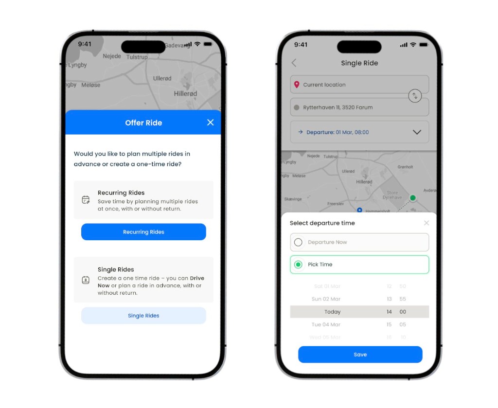
We reduced three ride creation flows to two:
Recurring Rides
Plan multiple rides in advance, with or without a return journey.
Single Rides
Create one ride, either now or at a planned time.
This allowed us to keep the flexibility drivers needed while removing unnecessary decisions.
We also simplified the Single Ride flow by 50%.
The experience became shorter, more consistent and easier to understand.
Most importantly, we introduced a subtle nudge toward planning rides ahead.
We weren't forcing users into a different behavior.
We were making the more valuable behavior easier.
Designing for both sides of the marketplace
One of the biggest lessons from this project was that UX doesn't exist in isolation.
Nabogo is a two-sided experience.
A driver's decision affects the passenger's ability to find and book a ride. A seemingly small interaction in one part of the product can therefore influence the entire carpooling ecosystem.
This meant we couldn't evaluate the ride creation flow only by asking:
"Is this easier for the driver?"
We also needed to ask:
"Does this create a better experience for everyone involved?"
That changed how we evaluated our design decisions.
Less complexity. More consistency.
Removing a flow wasn't just about reducing the number of screens.
It gave us an opportunity to create a more consistent mental model across ride creation.
Instead of teaching users several different ways to create a ride, we created a clearer structure:
Recurring or Single.
Plan ahead when possible.
Fewer paths meant less cognitive load, fewer instructions and less time spent learning the interface.
And because the flows shared more of the same structure, the experience became easier to scale and maintain from a design and development perspective.
The results
Two months after launching the new experience, we started seeing the impact.
150+ users rated the new ride creation flow 4.11/5.
We also saw:
- More new users planning rides in advance
- 100% of rides becoming public
- A shorter and more consistent ride creation experience
- Less complexity across the different ride journeys
The numbers reinforced something we had suspected from the beginning:
Simplification can be a growth strategy.
The bigger lesson
As designers, it's easy to associate progress with addition.
A new feature.
A new screen.
A new interaction.
A new capability.
But sometimes the most valuable design work happens when you question what is already there.
What can disappear?
What decision can we remove?
What explanation no longer needs to exist?
What journey can become one step shorter?
For Nabogo, the answer wasn't another feature.
It was removing complexity and making the right path easier to follow.
Because great product design isn't always about giving people more.
Sometimes it's about giving them less to think about.